We recently got a Kindle Fire for a project that we are currently working on and I was really impressed with it so felt I should provide a review.
In case you are not aware, the Kinde Fire is Amazon’s Android Tablet. It is a 7 inch tablet which runs a highly customized version of Android (2.3 for those that want to know). The device is also geared towards the Amazon ecosystem so gone are the typical Android Market, instead you get the Amazon store. You do get access to the amazing selection of books from Amazon, as well as MP3s, and movies for purchase or streaming. It sells for $200 US which is one of the cheapest tablet devices on the market. Now in order to get the device to that price, Amazon had to cut on some capabilities which are common in more expensive tablets like the iPad, the Motorola Xoom, or the Samsung Galaxy Tab, so gone are the cameras, microphone, GPS, memory expansion slots, and cellular connectivity. Basically you get a low memory tablet (8GB) with Wifi only. No more no less. Now what you do get is an overal very polished user experience. Of all the Android devices I have tried, this device takes the cake coming very close to the polished experience you get on iOS. Now with that come some drawbacks but if you are looking for a simple device that lets you “read your mail, browse the web, watch YouTube, purchase and read books, get apps on it, play your music collection” this device maybe for you.
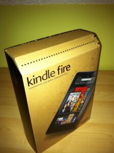
When I say polished, I mean that Amazon did spend some time to review the whole user experience. The box itself is well designed and easy to open. They use the term “Certified Frustration Free Packaging” which is nice to see compared to all these heavy plastic packages that are common on cheap consumer electronics these days.

You open the box and much like for iOS device, you see the device right away. It has already been charged (sorry I can’t remember to what %) so you can start using the device right away. I guess gone are the days where it says “please charge the device for 12 hours” which is a great thing. The battery life for the device is also excellent. I have used it quite a bit in the last 4 weeks since the purchase and only had to recharge the device twice. Every time I try to use the Motorola Xoom, the battery needs to be recharged.
Inside the box, you find the device and a power adapter and nothing else. Yes no USB cable. I don’t understand that one. Not much of an issue for me as I had one lying around but could be for some.
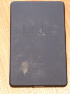
The device is well built and feels like a top notch product even though it is cheap. By comparison, the Samsung Galaxy Tab 10.1 is twice the price and to me doesn’t have the same level of overal feel that this device does. I don’t know what it is but the Galaxy Tab just doesn’t feel right to me. The Kindle Fire can be held nicely in one hand and the back of the device has a very nice rubber grip so you are pretty much guaranteed that the device won’t slide out of your hand. One drawback with the rubber grip material that they used is that it tends to attract smudge as you can see from the picture below. It is almost impossible to wipe it off either.

When you power it, you are guided through some very simply steps to get your device going (setting up Wifi and registering your Amazon account). Now one issue I did run into is that when I first tried to register my Amazon account, it was failing to authenticate. I thought it was because I was using a Amazon.ca account so I then created an Amazon.com account and tried that but that didn’t make a difference. Fortunately you can skip that step and start using the device. I was eventually able to register the device.
Now one drawback (for Canadians) with the device is that it will not act nicely with the Amazon app store unless you have an American based credit card, something I don’t have. So I cannot buy apps, music, or books. That’s not too bad for my case as I wasn’t planning on buying too much on it; however, they also prevent you from getting free apps from the store and that’s just plain annoying. On other Android devices, you can get any free apps without ever having to provide a credit card. I don’t know why Amazon restricts it this way. Now one “nice” thing for the geekly inclined is that it is possible to “jailbreak” the device and then install the standard Android Market so that should resolve that issue. Moreover, the device comes preinstalled with a good selection of apps like Pulse, EPSN, Weather Channel, Facebook (although just a link to m.facebook.com), and Quick Office so I didn’t feel like I was missing much.
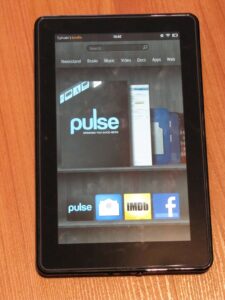
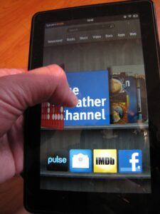
Once you get your device registered and going, you are greeted with a bookshelf looking UI with apps presented as items on the shelves. Upon further inspection you realize that the top shelf is a carousel which presents all recently used apps as well as recent books, music albums, and movies. It is very similar to the iOS list of apps that you get if you double tap the home button or on Android the apps swap button (sorry don’t know the real name); however it is right in your face. Also I really like the fact that your books (well that obvious since it is a Kindle after all) and music albums show up in there. Very useful when you buy a new music album (yeah I still do that once in a while) and you want to have it at your fingertips. The carrousel works very much like iTunes coverflow layout. You just need to swipe your finger (or my big ugly thumb) to cycle through the items.
The bottom shelves can contain 4 items per shelf (again apps, albums, books) for your most often used items.
At the top of the bookshelf, there is a set of shortcuts / tabs which brings you to complete list of one of the following groups:
Newsstand, Books, Music, Video, Apps, and Web.
Most of them actually bring another bookshelf with the full list of apps, music, books that you have on your device. One neat feature is that the shelves can also show you what is currently sitting in the cloud for your account. This feature is one way that Amazon was able to reduce the memory size for the device and keep the device inexpensive. You bought this app and don’t use it much? No problem, remove it from your device and keep it in the cloud. You need it back later, no problem, you can download it again. Now I haven’t been able to buy music or movies but from what I see it works the same way for them. Each shelf also provides a shortcut to get to the store to buy more apps, songs, and movies for your device.


The web browser is the final item in the tabs. The “Silk” browser was announced with much fanfare but has been really disappointing so far. I like the fact they included Google search into the address bar (like Chrome) but the browser is buggy (and I did upgrade to 6.2.2) and just doesn’t live up to the promise. Countless times I have tapped on links on a web page (with actual feedback that a tap occurred) and nothing happens. I have to tap couple more times before it goes. Also in some occasions, the back button brings you back to the home view (the landing bookshelf) instead of taking you back to the web page you were just at. It happens a lot in facebook which is quite frustrating. I’ve had one time as well where I was trying to load a web page and its content got mixed with the previous web page. The weirdness mix ever. Feedback that pages are in the process of loading is also very poor. That being said, one nice feature that they have is they have a “expand” button at the lower left of the screen so that you get rid of all the tabs and most buttons and dedicate more room to the web page.
The mail app is pretty standard. It is very much what you expect from a mail app. Setting it up was easy; however, if you do use Google Apps for your email, you need to make a few changes to the default gmail settings to make it work (chiefly that your username is your full email address and that the imap and smtp server are not based on your domain but on google so imap.gmail.com and stmp.gmail.com. Fortunately I was able to find out how to do that quickly with a simple google search. Actually since the device is becoming quite popular, it is very easy to find answers on your questions. There are quite a few forums dedicated to the Kindle Fire so if you run into any issues, it is pretty easy to find the answers you need. When writing anything on the device, there is a bar which provides you with option from what you are typing. One annoyance is that if it doesn’t recognize the word you are trying to type, you are forced to select something from that bar before hitting the space bar because they replace the space bar with “insert current auto selection”. So if you type words which are common for you but not for the device, you are constantly having to remember to click on the bar to select your word. Come to think of it, iOS has the same problem with its auto suggestion feature.
The music app is disappointing. It does what is pretty standard these days offering you to view your collection by playlists, artists, albums, or songs, but in order to listen to all your songs at once (without coming back to the device), you have to organize them in a playlist. You can create playlists on the fly but unfortunately you have to add songs one song at a time which is a bit of a pain. Also playlists are restricted to 500 songs so I only got from A to U. Apparently I can use an online app called cloudplayer to create larger playlists but that’s not available to Canadian customers. arggh. Also it is cumbersome to play your music in shuffle mode as you always have to pick a song first and then select shuffle. It needs a “shuffle” start button.
I was able to transfer my music on iTunes on my mac using this tool called iTunes Exporter and copy it via a USB cable to the music folder. The device then picked them up nicely and was able to download album arts for some of them. The sound quality of the onboard speakers is by far the best I have heard of all tablet devices we have (Galaxy Tab 10.1 and 7, Xoom, iPad, iPad 2). It still won’t replace having full size speakers on a dock but good to have if you have no other options to listen to your music. One drawback when listening to music is the lack of physical volume up or down buttons. So if you want to quickly turn music off, you may have to: Turn off the screen saver, relaunch the music app, find the now playing section, turn the volume down or press pause. A tad annoying. Again I assume that was done for cost purposes.
Movie playback quality is excellent. Again I was able to download a movie I had converted using HandBrake via the USB cable. Now one big issue I ran into is that if you transfer a file onto the device that the device doesn’t recognize, you are basically screwed. The device assumes the memory is taken and if you try to delete the file from your computer via the USB cable, the device won’t recognize the fact you did that and think the memory is still in use. In order to remove a file from the device, you must use the “Remove from device” shortcuts for whatever app manages the type of file you have on there. I had originally downloaded the movie as .m4v and the movie player didn’t recognize it so I deleted it and it assumed that there was still 1.2 GB used. I eventually had to restore the device. Now if I had full access to the store, I maybe able to find an file manager type app to deal with that. Eventually I realized that renaming the movie to .mp4 made the movie available for the gallery app and all was good. I bet if I had renamed the file on the device from .m4v to .mp4, that may have allowed me to remove it with the gallery app. Flash support is excellent as well. I was able to watch the Australian Open stream on TSN without glitches. Our $500 Galaxy Tab 7 can’t do that.
On a final note, you may have noticed that many of the images included here are actual pictures instead of screenshots, well that’s because once again here is an Android device without a way to take screenshots from the device without having to install an app.
Summary
Pros
– Nice form factor. Solid construction.
– Sharp screen
– Carrousel feature is excellent
– Overall polish and ease of use
– Great package
– Good sound from onboard speakers
– Supports iTunes files (including purchases)
– Long battery life
– Excellent Video Quality
– Easy to find help
Cons
– No quick way to adjust volume – no hard buttons beside power.
– Authentication failures on registration
– No way to get free apps in Canada
– Deleting apps via USB doesn’t remove it
– Space bar turns into insert
– Facebook app is not an app.
– No USB cable provided
– Poor browser
Conclusions
For $200, the Kindle Fire provides a great overall experience. It does have quite a few drawbacks (specially on the browsing side); however, you cannot buy a cheap Corolla and expect it to drive like a Porsche. What I have found though since I got the device is that it has become my go to tablet for reading the news while having breakfast or when wanting to check something quickly while watching TV. Its size makes it more convenient. 10 inches tablet on the kitchen table are just too big for me. Now for Canadians for now I don’t recommend the device due to the fact that you cannot install apps on it but for Americans, I can see this device taking a good share of the tablet market. It still has some ways to go to meet the entire experience from Apple’s iPad but is very close to providing it and maybe one or two revs away from it.
UPDATE March 27th: After using the device for about 2 months, I slowly realized that the issues with their mail client (not documented here but mostly comes down to poor feedback) and their browser make the device not the most reliable and found myself migrating back to my iPhone and iPad.


Share This Article